Paragraph Types
Paragraphs are the building blocks of content in Drupal. They are a collection of fields that are used to display content in a structured way. Examples of common paragraph types include: WYSIWYG, Full Width Callout, Accordion.

Paragraphs are added to pages in the "Content" section. Available paragraph types are listed in the Add Paragraph dropdown (see screenshot above). The available paragraph types are restricted by the Content Type of the page (see Content Types for more information about Content Types). Basic Pages allow nearly all paragraph types whereas Person pages, for example, only allow a subset of paragraph types.
Below is a list of all available Paragraph Types and their descriptions.
Accordion
Accordions are a collection of Accordion Rows that can be collapsed/expanded. The Accordion itself can display button/CTAs. Additionally, each Accordion Row can display a button/CTA as well as a title, label, subtitle, and price. Below is an example with each field named after its field name.

The Accordion was developed primairly to display memebership tiers (see NHM - Join Us (opens in a new tab))
Admission Info
Admission Info paragraph types are only available on the Hours and Admissions Content Types. They are intended to display the different ticket types for admission. You can see an example of the Admission Info paragraph type on the Plan Your Visit page (opens in a new tab).

Animation Callout
Admission Callout paragraph types are callouts that allow for an animated GIF. They function like most other callouts but have an open text fields for Background Color and Text Color.

Buy Tickets
The Buy Tickets paragraph type is only available for the Ticket Release Content Type. It was used when the museum was using Galaxy as its ticketing system. It is no longer used.
Callout Group
A Callout Group is a collection of Link Tiles (the squares that you see below). They are designed to display between 3-6 Link Tiles.
One Link Tile in a Callout Group can be a "Featured Callout" which will be displayed larger than the other Link Tiles. In the example below, the Featured Callout uses override fields to display a custom title, subtitle, button, and image. The other Link Tiles are using the linked entity's title and featured image.

Callout Slider
A Callout Slider is a collection of Link Tiles that can be scrolled through via arrow buttons (see below).

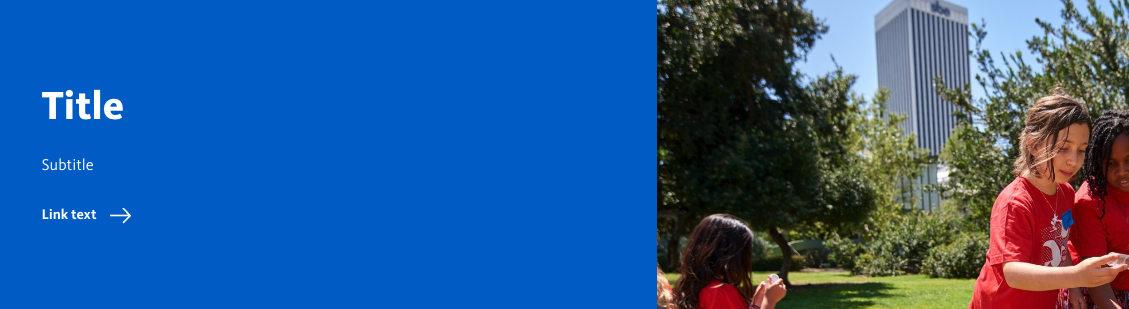
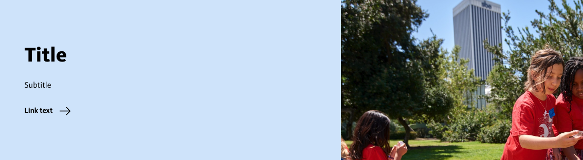
Condensed Callout
Condensed Callouts present a link to an NHMLAC entity (a Basic Page, Story, Exhibit page, Event page, ect) that span the entire page bleed. Unlike other Callouts they do not use Link Tiles. Instead of pulling in the title, image and link text from the linked entity, those fields must be manually entered. Below are examples of the various options for Condensed Callouts.

Events Main List
This Paragraph Type is only displayed on the Calendar. It is used to display a list of events. It is not used on any other page. Its only field is to choose if a featured event is displayed.
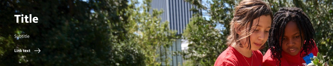
Full Width Callout
Full Width Callouts are most similar to Condensed Callout, except they do not span the entire page bleed. They are designed to be used in the "Full Width" region of a page. They can be used to display a link to an NHMLAC entity (a Basic Page, Story, Exhibit page, Event page, ect) or a link to an external URL.
Like Condensed Callouts they do not pull their title, image, subtitle, or label from the linked entity and instead must be manually entered.

H5P
H5P paragraph types are a collection of interactive components. They are used to create interactive content such as quizzes, games, and presentations.
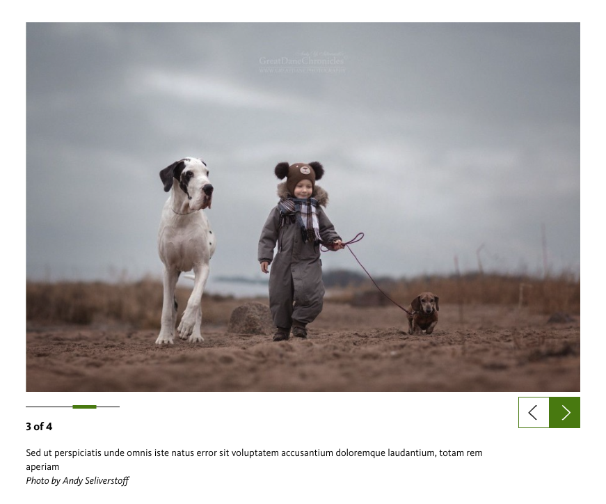
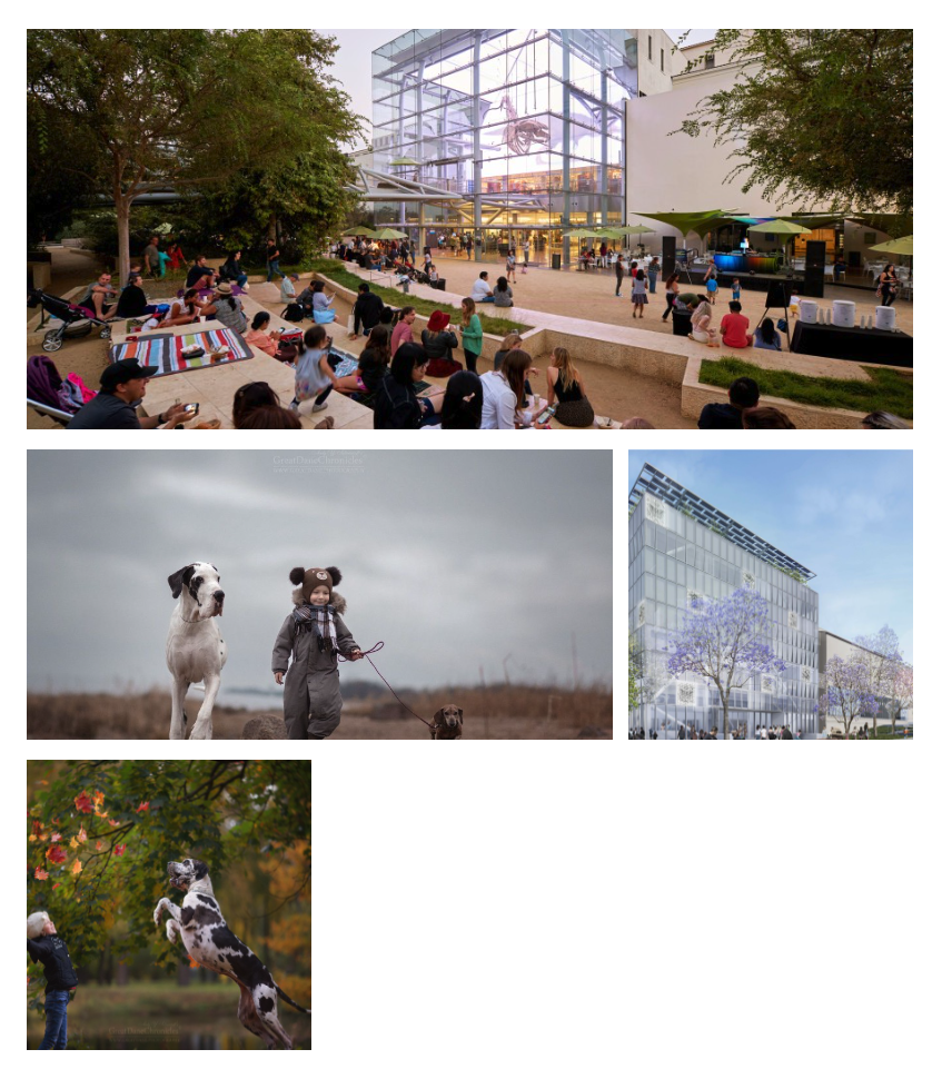
Inline Image Slideshow
A way to present multiple images. The "Image Mode" field determines how the images are displayed. See below for examples of each mode.
Default
The Default slideshow is carousel of images, similar to the Callout Slider. It displays the image's caption and credit.
Carousel
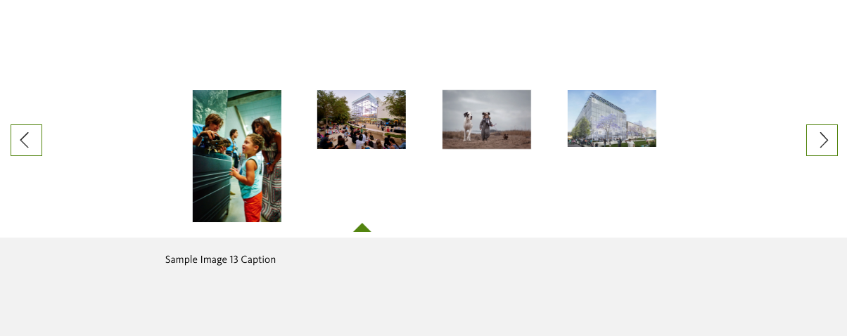
The Carousel mode was designed for square images. As apparent in the screenshot above, it does not work well with rectangular images.
Photo Essay
Link Tile
A Link Tile displays an image, label, and title pulled from a linked node (a Basic Page, Story, Exhibit page, Event page, ect). They are designed to provide a link to NHMLAC content in a visually appealing way. Link Tiles are not standalone entities but are instead used in Callouts.

In the example above, the Link Tile uses override fields to display a custom title, subtitle, link text, and image. If the override fields are set blank, it will use the linked entity's title, subtitle, link text and featured image.
List Display
List Displays are used to display of the items of a List content type. They were created by previous NHM developers but were never completed.
Magazine
Used exclusively for the Magazine content type.